FIRE TV Nomads
FIRE TV Nomads
FIRE TV Nomads
Redesign of Amazon's Fire TV Stick
Redesign of Amazon's Fire TV Stick
Redesign of Amazon's Fire TV Stick
Overview
Overview
Overview
Firestick: Nomads is a redesign of the Amazon Firestick experience tailored for international students and digital nomads. Built for a global audience navigating content, culture, and connection across borders.
Firestick: Nomads is a redesign of the Amazon Firestick experience tailored for international students and digital nomads. Built for a global audience navigating content, culture, and connection across borders.
Firestick: Nomads is a redesign of the Amazon Firestick experience tailored for international students and digital nomads. Built for a global audience navigating content, culture, and connection across borders.
Original System:
Original System:
Original System:
Poor Visibility of System Status
Poor Visibility of System Status
Poor Visibility of System Status
Hard to Focus, Aesthetically Cluttered
Hard to Focus, Aesthetically Cluttered
Hard to Focus, Aesthetically Cluttered
Hard to Recognize some functions
Hard to Recognize some functions
Hard to Recognize some functions
Problem
Problem
Problem
Streaming Wasn't Designed for People on the Move
Our research revealed friction points faced by users who are frequently on the move. Regional content locks, poor onboarding,
and lack of cultural or social adaptability. The existing Firestick experience didn’t support life between countries.
Streaming Wasn't Designed for People on the Move
Our research revealed friction points faced by users who are frequently on the move. Regional content locks, poor onboarding,
and lack of cultural or social adaptability.
Streaming Wasn't Designed for People on the Move
Our research revealed friction points faced by users who are frequently on the move. Regional content locks, poor onboarding,
and lack of cultural or social adaptability. The existing Firestick experience didn’t support life between countries.
Interviews
Interviews
Q: Can you recall a time when it was
difficult to find something to watch?
Q: Can you recall a time when it was
difficult to find something to watch?
Q: Can you recall a time when it was
difficult to find something to watch?
Firestick Owner
Firestick Owner
Firestick Owner
Usually I have to dig deep to find a good show. But I mostly rely on friends’ recommendations.
Usually I have to dig deep to find a good show. But I mostly rely on friends’ recommendations.
Usually I have to dig deep to find a good show. But I mostly rely on friends’ recommendations.
“
“
“
“
“
“
Q: How important is access to
your native language?
Q: How important is access to
your native language?
Q: How important is access to
your native language?
International
Student
International
Student
International
Student
It’s very important for staying connected with my home culture. Especially on special holidays
It’s very important for staying connected with my home culture. Especially on special holidays
It’s very important for staying connected with my home culture. Especially on special holidays
“
“
“
“
“
“

Q: Are you interested in the
local streaming culture?
Q: Are you interested in the
local streaming culture?
Q: Are you interested in the
local streaming culture?
Nomad
Nomad
Nomad
Currently avoiding it, because
I don’t speak the language.
But I want to because It’s the best way to learn
Currently avoiding it, because
I don’t speak the language.
But I want to because It’s the best way to learn
Currently avoiding it, because
I don’t speak the language.
But I want to because It’s the best way to learn
“
“
“
“
“
“

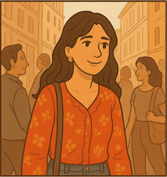
Persona
Persona
Persona
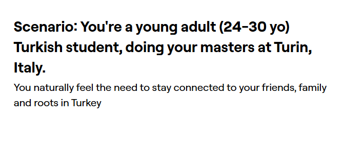
I took what I learned about my target users' struggles, and visualized it into a persona "Yasmin". She's a 24 yo, Turkish student, living in Turin to pursue her Msc in Architecture.
I took what I learned about my target users' struggles, and visualized it into a persona "Yasmin". She's a 24 yo, Turkish student, living in Turin to pursue her Msc in Architecture.
I took what I learned about my target users' struggles, and visualized it into a persona "Yasmin". She's a 24 yo, Turkish student, living in Turin to pursue her Msc in Architecture.

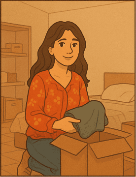


Yasmin is going to Turin, to study Architecture
Yasmin is going to Turin, to study Architecture
Yasmin is going to Turin, to study Architecture
She arrives and is excited to start a new adventure
She arrives and is excited to start a new adventure
She arrives and is excited to start a new adventure
Yasmin wishes she could communicate with locals
Yasmin wishes she could communicate with locals
Yasmin wishes she could communicate with locals
She occasionally feels homesick
She occasionally feels homesick
She lost access to her shows from back home
She lost access to her shows from back home
She occasionally feels homesick
She lost access to her shows from back home
Mission & Vision
Mission & Vision
Mission & Vision
Firestick: Nomads reimagines streaming for international students and digital nomads, offering a portable, intuitive, and culturally adaptive experience. It helps users feel at home anywhere by making content access seamless and socially connected.
Firestick: Nomads reimagines streaming for international students and digital nomads, offering a portable, intuitive, and culturally adaptive experience. It helps users feel at home anywhere by making content access seamless and socially connected.
Firestick: Nomads reimagines streaming for international students and digital nomads, offering a portable, intuitive, and culturally adaptive experience. It helps users feel at home anywhere by making content access seamless and socially connected.

nomads

nomads
nomads
Key Features
Key Features
Cultural Integration: A dedicated Learn section helps users pick up the local language through contextual media.
Cultural Integration: A dedicated Learn section helps users pick up the local language through contextual media.
Freedom of Access: Firestick: Nomad includes a built-in VPN, giving users quick access to content from their home or preferred regions without regional barriers.
Freedom of Access: Firestick: Nomad includes a built-in VPN, giving users quick access to content from their home or preferred regions without regional barriers.
Connection Through Media: To foster social connection, we introduced a friend-based recommendation system that makes it easy to share titles and build watchlists shaped by your circle.
Connection Through Media: To foster social connection, we introduced a friend-based recommendation system that makes it easy to share titles and build watchlists shaped by your circle.
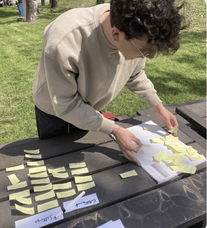
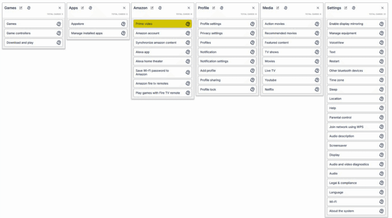
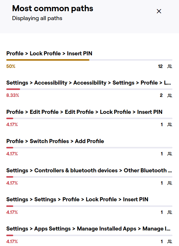
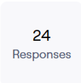
Information Architecture
Information Architecture
Conducted a few tests to examine the current information architecture of the original Amazon Fire TV. Started with 2 rounds of Open & Closed Card sorting to define issues and points of struggles with our current Target users. Then build a New IA and tested it with a Tree-Test.
Conducted a few tests to examine the current information architecture of the original Amazon Fire TV. Started with 2 rounds of Open & Closed Card sorting to define issues and points of struggles with our current Target users. Then build a New IA and tested it with a Tree-Test.

Open Card Sort
Open Card Sort
Open Card Sort
Closed Card Sort
Closed Card Sort
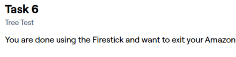
Tree-Test
Tree-Test
Closed Card Sort
Tree-Test
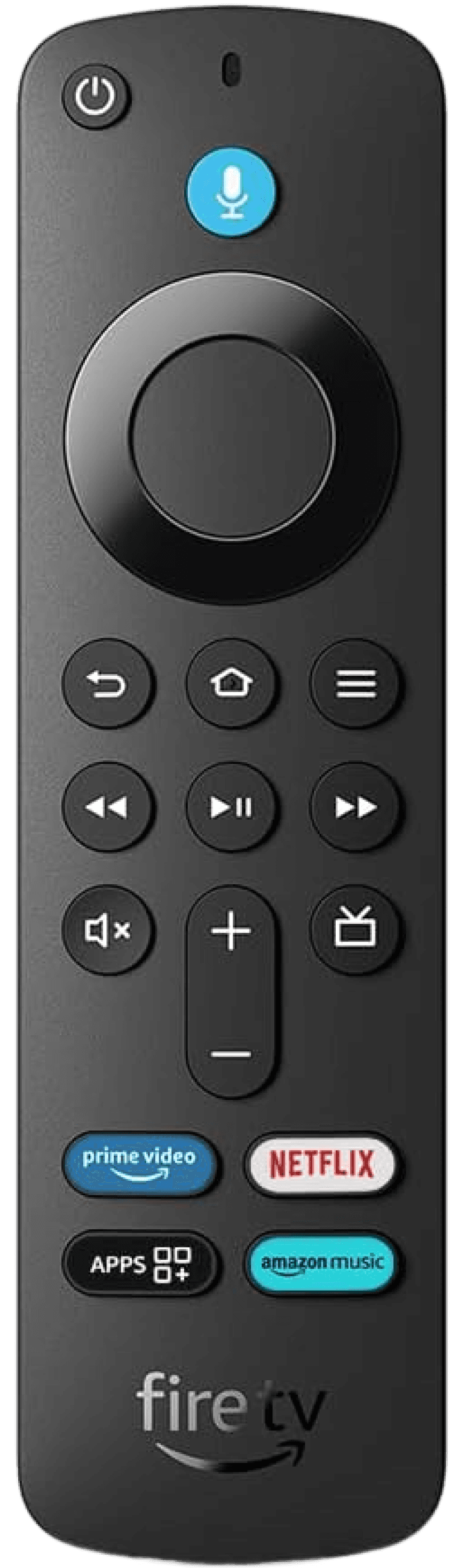
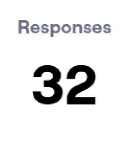
Remote Usability Testing
The original Firestick remote had a cluttered layout with redundant buttons and unclear functions. Users often ignored media controls, relying instead on the navigation ring for playback. Quick-launch app buttons were rarely used, and system buttons like “Menu” or “Live TV” caused confusion due to inconsistent behavior. This made the remote unintuitive, especially for first-time users.
Open Card Sort
Open Card Sort


Strenghts
Strenghts
Strenghts
Strenghts
Strenghts
Strenghts
Strenghts
Strenghts
Strenghts
Strenghts
Design
Design
My design process began with two low-fidelity prototypes, each exploring different navigation structures and content organization. These early directions were based on smart TV usage patterns and research on best practices, helping me evaluate layout logic and user flow before moving to higher fidelity.
My design process began with two low-fidelity prototypes, each exploring different navigation structures and content organization. These early directions were based on smart TV usage patterns and research on best practices, helping me evaluate layout logic and user flow before moving to higher fidelity.
Visible
Visible

Featured content
Featured content
Favorite Apps
Favorite Apps
Continue watching
Continue watching
Recently added
Recently added
Connected Apps
Connected Apps

Search
Search
Profile
Profile
Home
Home
Live TV
Live TV
Film & Series
Film & Series
Games
Games
Settings
Settings
Help
Help
i
i


Visible
Featured content
Favorite Apps
Continue watching
Recently added
Connected Apps
Search
Profile
Home
Live TV
Film & Series
Games
Settings
Help
i
Wireframes
The wireframe introduced a simplified side menu and cleaner layout, laying the foundation for key features like the Learn tab and friends’ recommendations while reducing visual clutter.
Wireframes
The wireframe introduced a simplified side menu and cleaner layout, laying the foundation for key features like the Learn tab and friends’ recommendations while reducing visual clutter.
Moodboard
Defined the emotional tone of the product, to reduce cognitive load while subtly evoking a feeling of safety and familiarity in the interface.
Moodboard
Defined the emotional tone of the product, to reduce cognitive load while subtly evoking a feeling of safety and familiarity in the interface.
Open Card Sort
Open Card Sort


Style Guide
Style Guide
I created a style guide with legible fonts and a high-contrast color palette for TV screens. Warm accents like orange highlight features (learning), while neutral tones keep the interface clean and accessible.
I created a style guide with legible fonts and a high-contrast color palette for TV screens. Warm accents like orange highlight features (learning), while neutral tones keep the interface clean and accessible.
Font Used
Font Used
Aa
Aa
Amazon Ember
Amazon Ember
Bold
Bold
Aa
Aa
Amazon Ember
Amazon Ember
Medium
Medium
Aa
Aa
Amazon Ember
Amazon Ember
Regular
Regular
Heading
Heading
Body
Body
Other
Other
Headline - Amazon Ember 28/32
Headline - Amazon Ember 28/32
Sub Text - Amazon Ember 20/24
Sub Text - Amazon Ember 20/24
Description - Amazon Ember 18
Description - Amazon Ember 18
Display Large - Amazon Ember Display 50/55
Display Large - Amazon Ember Display 50/55
Display Medium - Amazon Ember Display 42/48
Display Medium - Amazon Ember Display 42/48
Display Small - Amazon Ember Display 34/38
Display Small - Amazon Ember Display 34/38
Category - Amazon Ember 22
Category - Amazon Ember 22
Button Large - Amazon Ember 18
Button Large - Amazon Ember 18
Chat - Amazon Ember 16
Chat - Amazon Ember 16
Button Small - Amazon Ember Bold 14
Button Small - Amazon Ember Bold 14
Gradients
Gradients
Dark Blue
Dark Blue

Light Blue
Light Blue
Orange
Orange
Alert & Status
Alert & Status
Success
Success
#0CBB00
#0CBB00
Info
Info
#004CE8
#004CE8
Warning
Warning
#E5D600
#E5D600
Error
Error
#D10202
#D10202
Disabled
Disabled
#C4C4C4
#C4C4C4
Dis. Button
Dis. Button
#67687D
#67687D
Main
Main
Primary
Primary
#0E1B26
#0E1B26
Secondary
Secondary
#1B374E
#1B374E
Tertiary
Tertiary
#0E1B26
#0E1B26
Grayscale
Grayscale
#0E1B26
#0E1B26
Gradients
Dark Blue
Light Blue
Orange
Alert & Status
Success
#0CBB00
Info
#004CE8
Warning
#E5D600
Error
#D10202
Disabled
#C4C4C4
Dis. Button
#67687D
Main
Primary
#0E1B26
Secondary
#1B374E
Tertiary
#0E1B26
Grayscale
#0E1B26
Design System
Design System
The design system established consistent components for navigation, cards, buttons, and layouts. It ensured visual cohesion, simplified iteration, and allowed new features to be integrated seamlessly across screens.
The design system established consistent components for navigation, cards, buttons, and layouts. It ensured visual cohesion, simplified iteration, and allowed new features to be integrated seamlessly across screens.
15px
15px
15px
Corner: 8
Corner: 8
Corner: 8
15px
15px
15px
15px
15px
15px
15px
15px
15px
20px
20px
20px
20px
20px
20px
10px
10px
10px
Stroke: 2 (Outside)
Stroke: 2 (Outside)
Stroke: 2 (Outside)
16px
16px
16px
32px
32px
32px
Corner: 8
Corner: 8
Corner: 8
8px
8px
8px
13px
13px
13px
18px
18px
18px
Stroke: 2 (Outside)
Stroke: 2 (Outside)
Stroke: 2 (Outside)
41px
41px
41px
41px
41px
41px
32px
32px
32px
12px
12px
12px
14px
14px
14px
Corner: 50
Corner: 50
Corner: 50
14px
14px
14px
14px
14px
14px
14px
14px
14px
16px
16px
16px
16px
16px
16px
6px
6px
6px
Stroke: 2 (Outside)
Stroke: 2 (Outside)
Stroke: 2 (Outside)
16px
16px
16px
Hover
Hover
Hover
Non Hover
Non Hover
Non Hover
Drop Shadow
Drop Shadow
Drop Shadow
Hover
Hover
Hover
No Hover
No Hover
No Hover
Turned OFF
Turned OFF
Turned OFF
Selection
Selection
Selection
Selected
Selected
Selected
Not Selected
Not Selected
Not Selected
Non Hover
Non Hover
Non Hover
(Add Dark Gradient)
(Add Dark Gradient)
(Add Dark Gradient)
Hover
Hover
Hover
Comment
Comment
Comment
Comment
Comment
Comment
Profile
Profile
Profile
(Add Buttom Gradient)
(Add Buttom Gradient)
(Add Buttom Gradient)

Non Hover
Non Hover
Non Hover
(Add Dark Gradient)
(Add Dark Gradient)
(Add Dark Gradient)
Hover
Hover
Hover
(Remove Gradient)
(Remove Gradient)
(Remove Gradient)
Testing
Testing
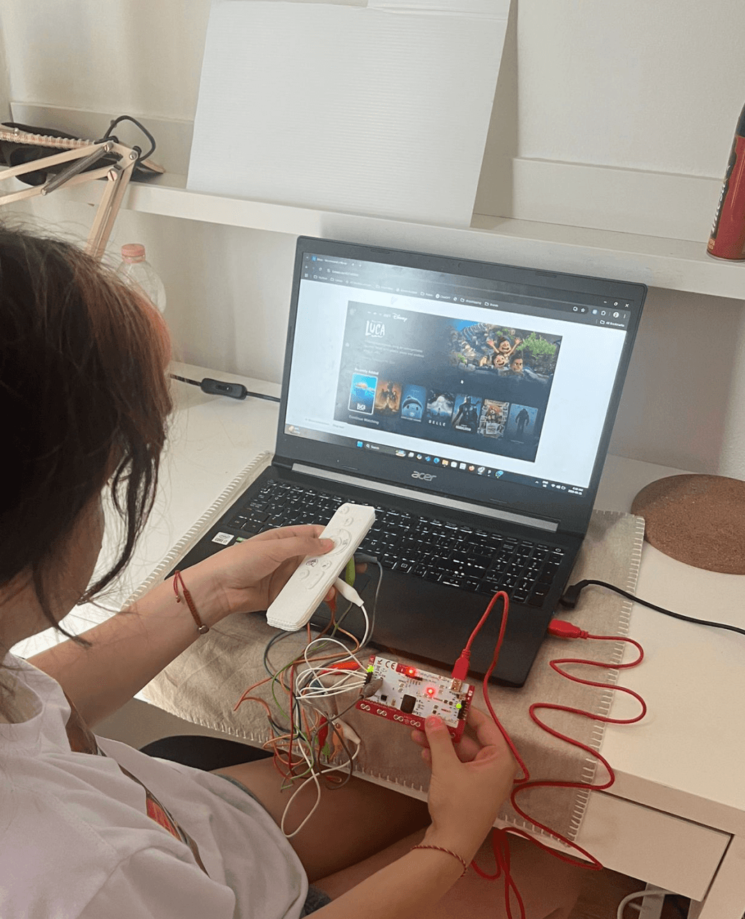
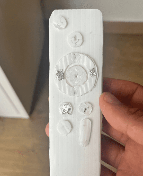
Hi-Fi Tests 1 and 2 helped validate both the interface and physical remote. In Test 1, five users tested a Makey Makey-powered cardboard remote in moderated sessions, while others used keyboard mappings. Feedback led to changes in VPN access, messaging, and content navigation. Test 2 introduced these refinements, like automated region switching and clearer labels, resulting in smoother task completion and confirming the value of hands-on, physical testing early in the process.
Hi-Fi Tests 1 and 2 helped validate both the interface and physical remote. In Test 1, five users tested a Makey Makey-powered cardboard remote in moderated sessions, while others used keyboard mappings.
Hi-Fi Tests 1 and 2 helped validate both the interface and physical remote. In Test 1, five users tested a Makey Makey-powered cardboard remote in moderated sessions, while others used keyboard mappings. Feedback led to changes in VPN access, messaging, and content navigation. Test 2 introduced these refinements, like automated region switching and clearer labels, resulting in smoother task completion and confirming the value of hands-on, physical testing early in the process.
Want to try it for yourself?
Want to try it for yourself?
Bellow you'll find links for early prototype testing, in addition to final Prototype. Feel
free to play around and re-live the whole process with me. Use your keyboard to simulate the actual remote (just click with your mouse once inside the screen to begin).
Bellow you'll find links for early prototype testing, in addition to final Prototype. Feel
free to play around and re-live the whole process with me. Use your keyboard to simulate the actual remote (just click with your mouse once inside the screen to begin).
Navigation:
Navigation:
Press:
Press:
Long Press:
Long Press:

Z
Z

X
X

F
F

G
G

Note: You need to press on the screen with your mouse
first to activate your remote control
Note: You need to press on the screen with your mouse
first to activate your remote control
End Product
End Product
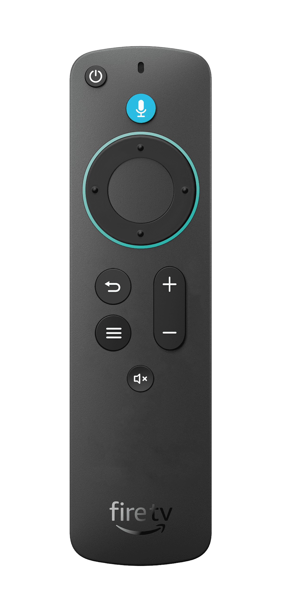
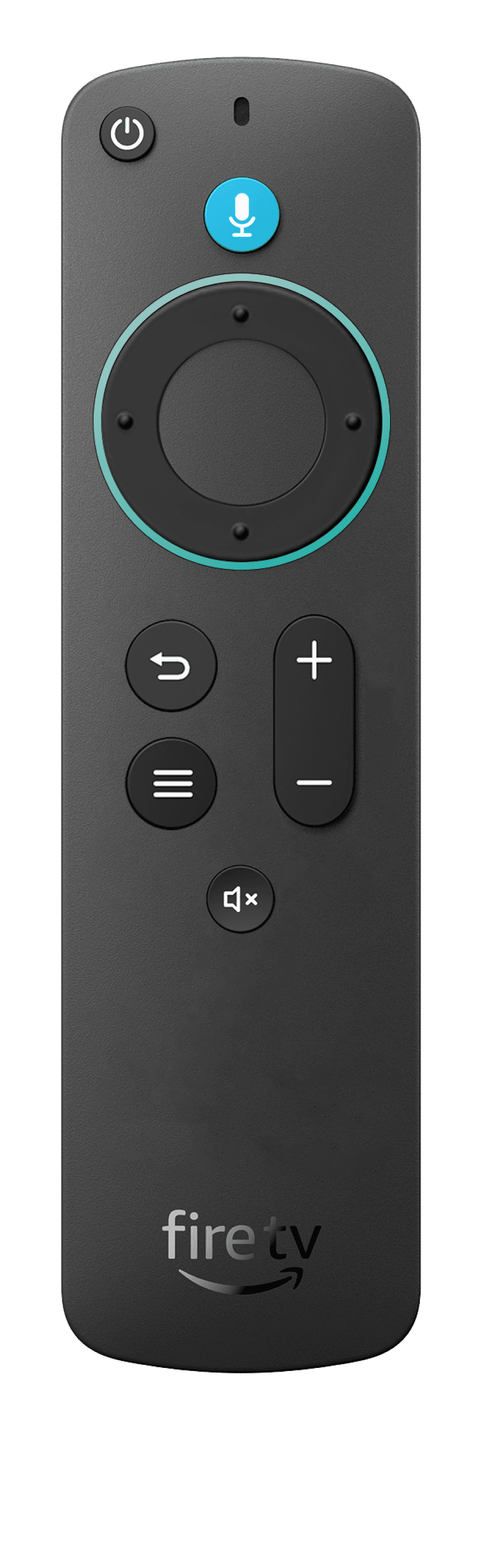
Remote Redesign
Remote Redesign
The remote was redesigned with fewer, more intuitive buttons and a matching tactile navigation ring for better grip and clarity. A circular LED light was added around the navigation pad to give visual feedback, changing color for actions like loading, errors, and Alexa input. Buttons also light up in night mode for added accessibility.
The remote was redesigned with fewer, more intuitive buttons and a matching tactile navigation ring for better grip and clarity. A circular LED light was added around the navigation pad to give visual feedback, changing color for actions like loading, errors, and Alexa input. Buttons also light up in night mode for added accessibility.
Digital Prototype
Digital Prototype
The final design tied all phases together, shaped by continuous testing insights. Region switch buttons were added to key screens like Home, Stream, and Apps for better visibility. The quick access menu was refined with clearer icons and naming, especially for Messages, making the system more intuitive and responsive to user needs.
The final design tied all phases together, shaped by continuous testing insights, making the system more intuitive and responsive to user needs.
The final design tied all phases together, shaped by continuous testing insights. Region switch buttons were added to key screens like Home, Stream, and Apps for better visibility. The quick access menu was refined with clearer icons and naming, especially for Messages, making the system more intuitive and responsive to user needs.